Completing the register in under 3 minutes — every class, every day.
We replaced a fragmented, desktop-bound 7–10 minute attendance process with a mobile-first progressive web app that teachers could complete one-handed, mid-lesson, without looking away from the class.
The result: a 57% reduction in attendance admin time across the pilot — time that went back to teaching, reading groups, and one-to-one student engagement.
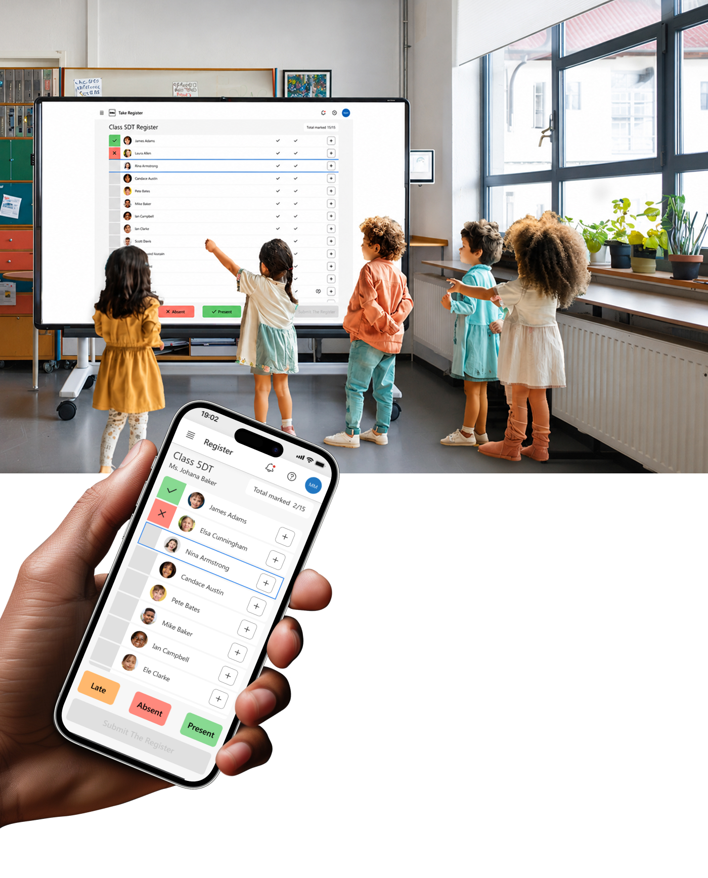
The Challenge
UK primary school teachers were spending 7–10 minutes per class taking attendance — not because marking students present is hard, but because the tools forced them to it. The MIS (management information system) was desktop-only, required login, and timed out mid-session. Pupil contact records lived in a separate part of the system, requiring multiple navigation steps to reach during an incident. Teachers were context-switching across tools during the most demanding hours of their day.
The Brief
Reimagine a mobile-first teacher experience that brings together attendance, pupil information, and everyday classroom administration — reducing administrative effort while ensuring fast, accurate, and compliant record keeping.
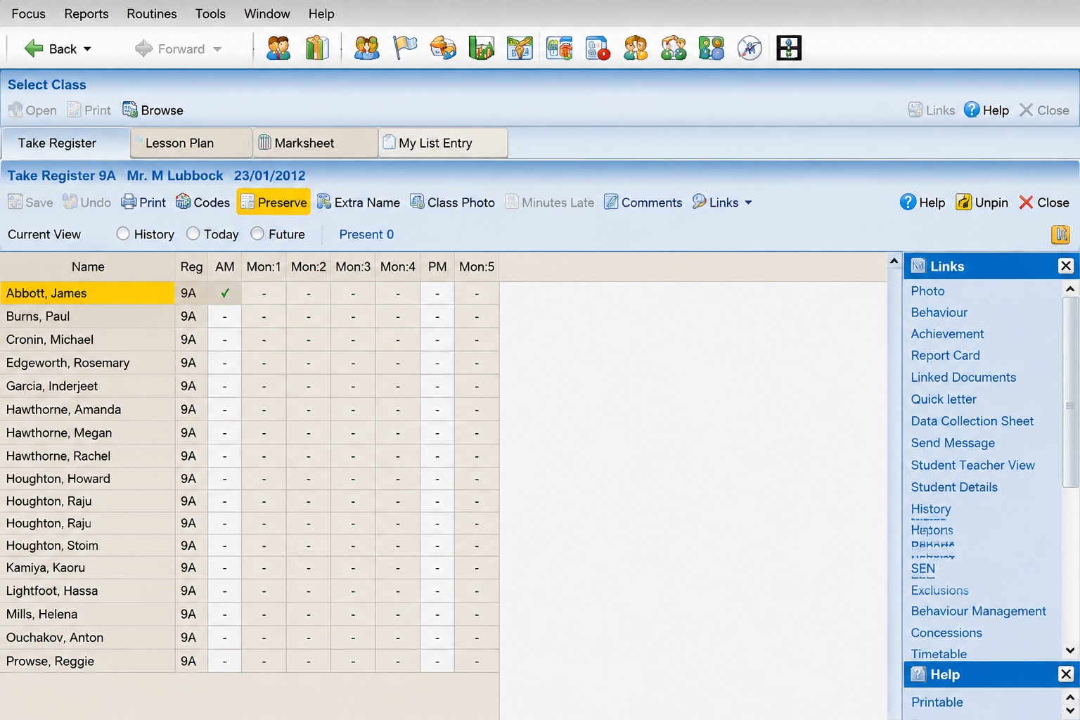
Legacy MIS Experience — Existing desktop-based attendance and pupil management workflows
Key Insights
I collaborated with the teacher product design team to research across 7 head teachers, 7 teachers, and 5 school admins — spanning LA, MAT, and Independent schools. Five findings shaped the design.
Core Flows
Research pointed to two areas where teachers lost the most time. For the pilot, we prioritised a fast and nimble class register — one that fit into the first minutes of a lesson without friction — and an efficient pupil profile experience that put the right contact information in front of teachers the moment they needed it.
Flow 1 — Register
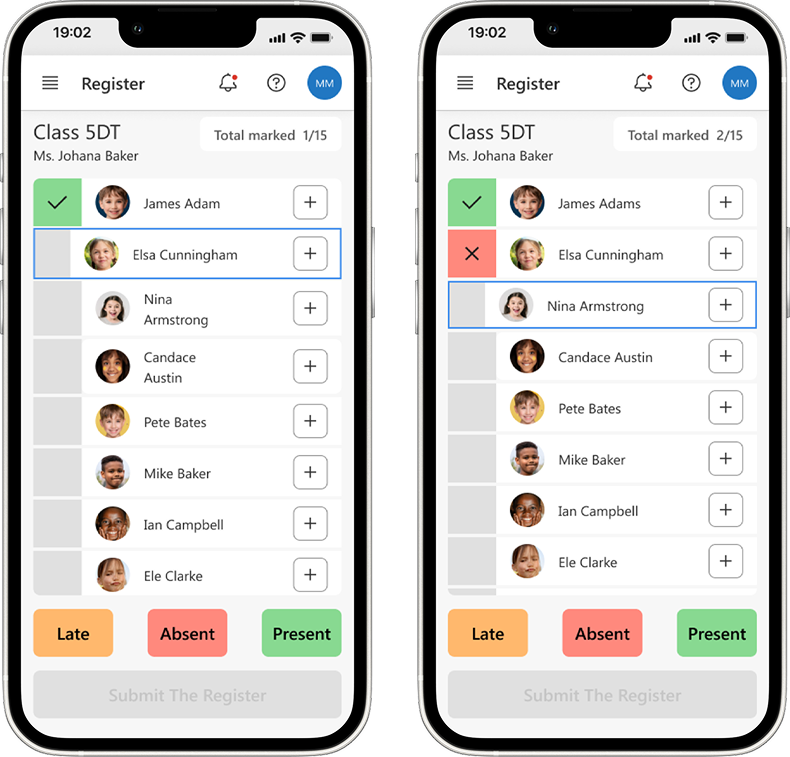
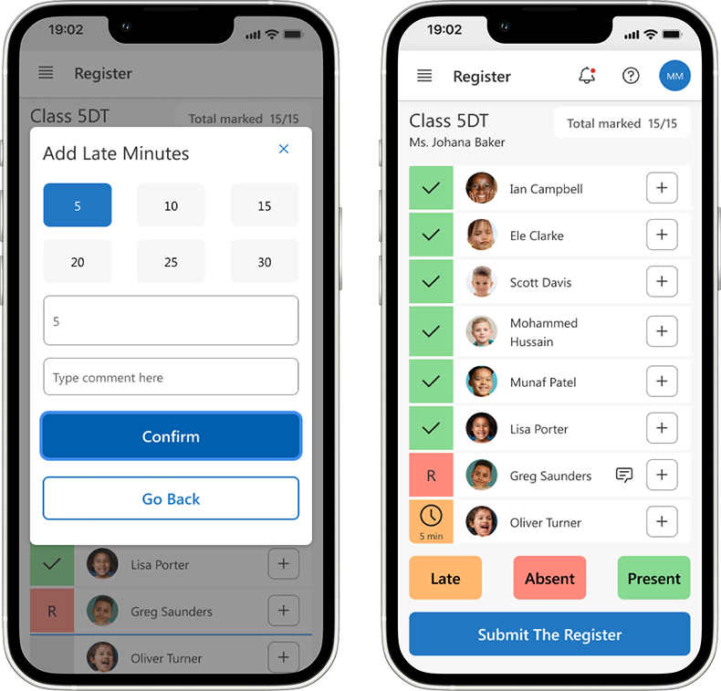
Smooth Transition into the Register
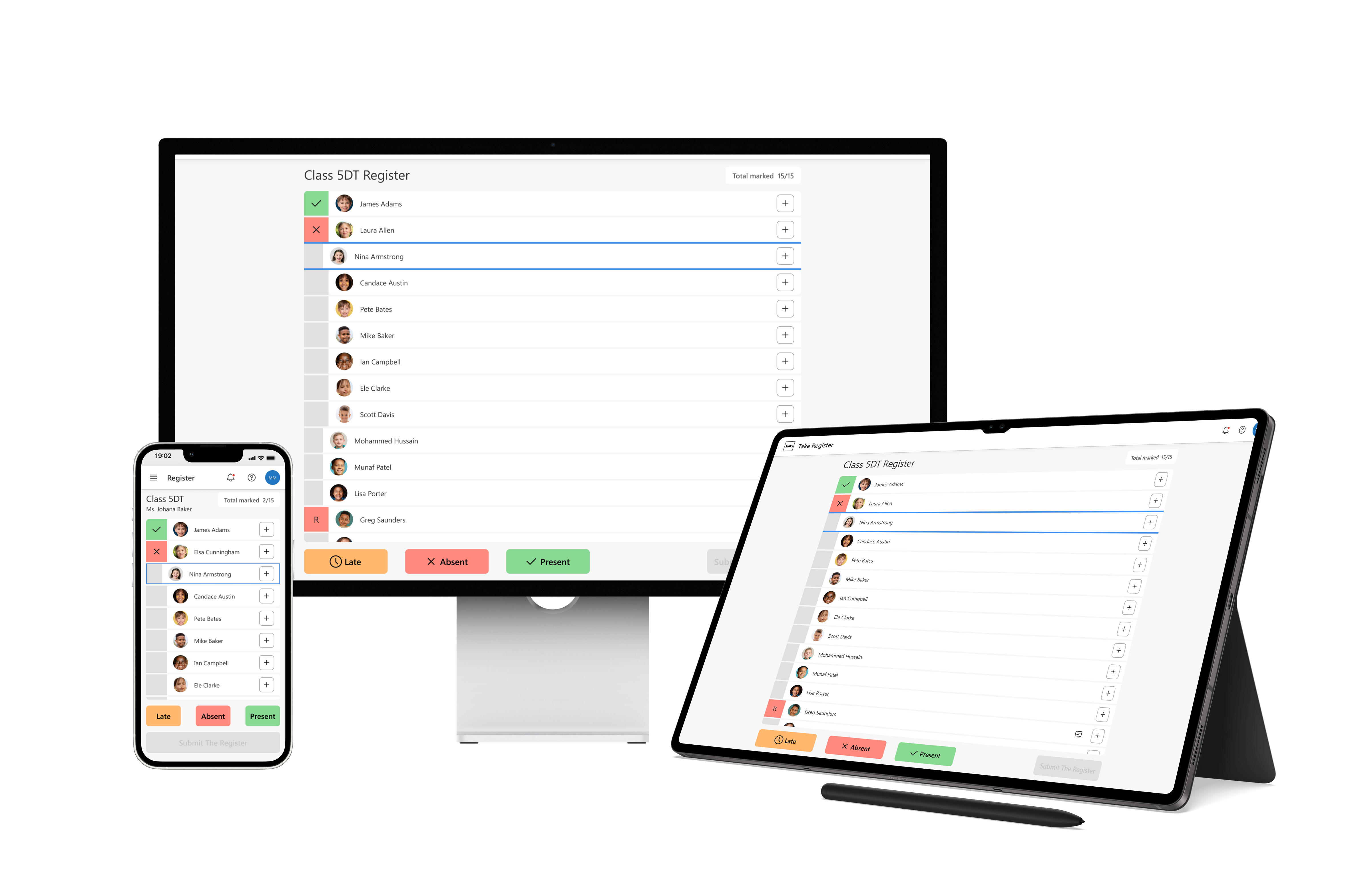
The class list loads pre-populated — no manual setup. If the office has flagged a pupil or sent a reminder (e.g. a known absence notified by a parent), it surfaces at the top before the teacher marks a single name. No context-switching between SIMS and a separate message thread; everything the teacher needs is in one place before they begin.
Flow 2 — Attendance Codes
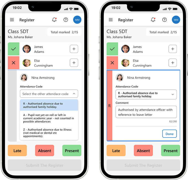
Marking Additional Codes
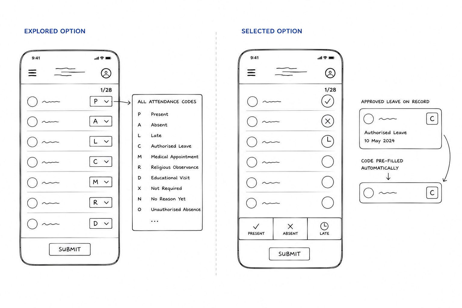
When a pupil has an approved leave request on record, the relevant DfE code pre-fills directly in the attendance slot — the teacher just confirms with one tap. No need to recall or look up a code mid-register. For unplanned absences requiring a specific code, a focused picker surfaces only the contextually relevant options rather than the full 20+ list.
Flow 3 — Late Markings
Marking Late Arrivals Effortlessly
Late arrivals don't require reopening the register. A persistent late-mark shortcut lets teachers log an arrival mid-lesson with two taps — pupil name and time of arrival are captured automatically. The register updates in the background and the DfE-compliant late code is applied without the teacher needing to know it.
Flow 4 — Pupil Profile
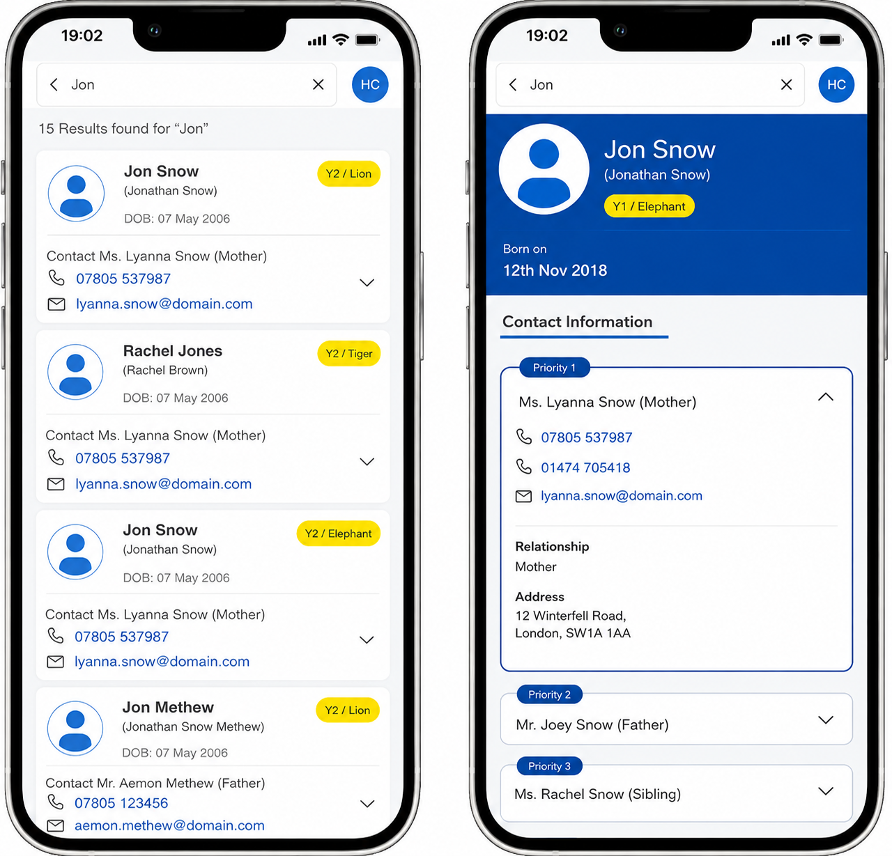
Search, Profile & Contact
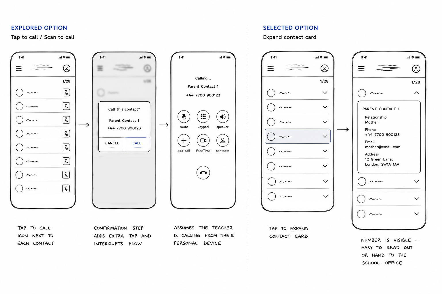
A simple name search surfaces a minimal profile — only what the teacher needs mid-incident. Contacts are shown in priority order, with the most reachable number first. The app nudges schools to keep parent contact details up to date by surfacing stale entries at a glance. No digging through SIMS to find a number that might have changed months ago.
From Concepts to Decisions
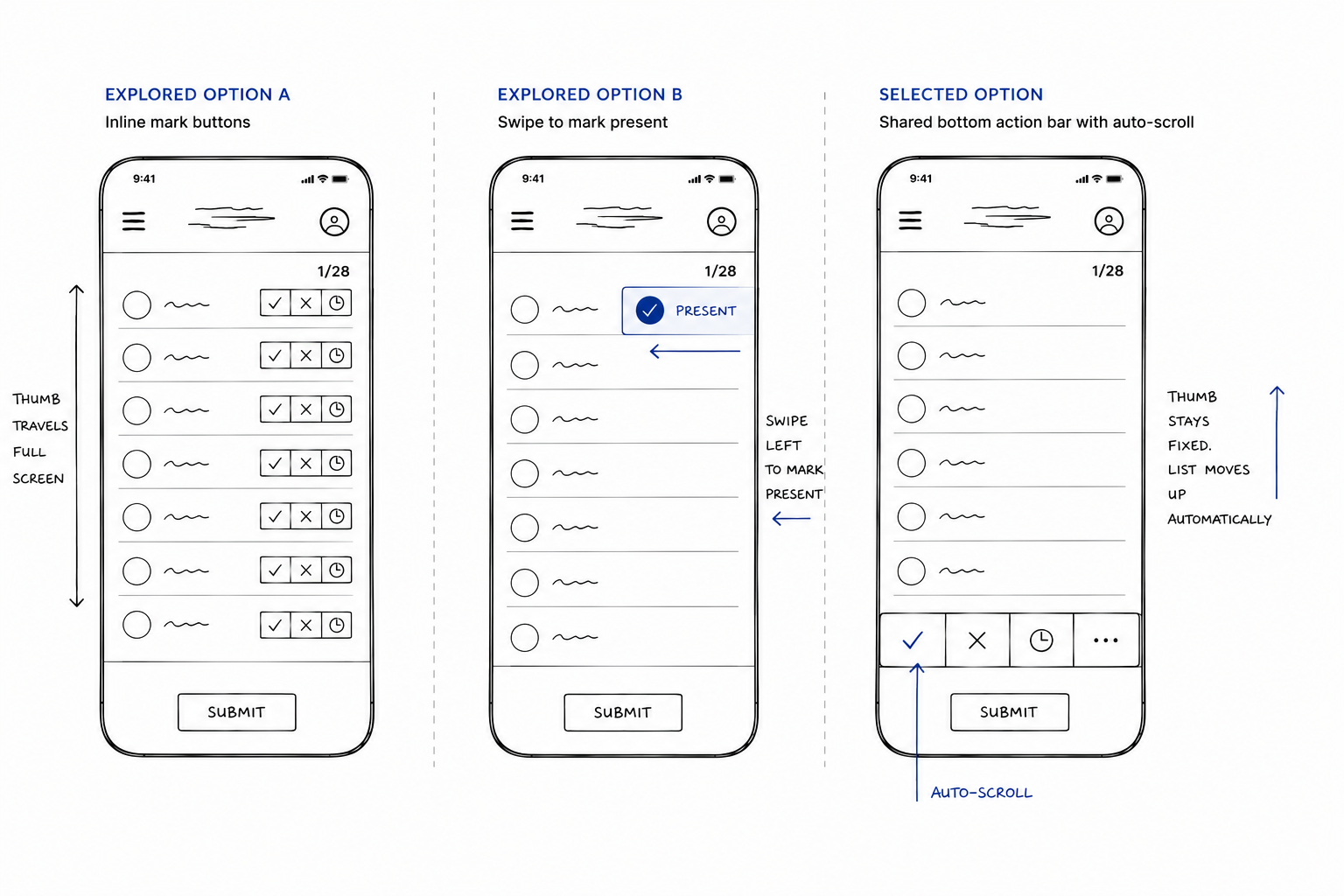
Three interaction decisions that balanced speed, usability, and classroom realities.
Delivering the Core Experience
We scoped the MVP around Quick Register and Pupil Profile & Contact — the two workflows teachers used most frequently and that had the greatest impact on reducing classroom administration.
The first release delivered Quick Register for fast attendance marking and Pupil Profile & Contact for immediate access to pupil records and priority contacts, establishing the core teacher experience before expanding the platform in later iterations.
Constraints
School Wi-Fi is notoriously unreliable. The app had to work fully offline and sync when a connection was restored — no lost registers.
MIS sync required building a custom API wrapper around the existing SIMS integration — no off-the-shelf connector existed.
The app had to meet DfE guidelines on pupil data handling before any pilot school could participate — compliance was a gate, not an afterthought.
There was no existing component library to build on. I established design tokens, core components, and interaction patterns from scratch — growing the library iteratively as each feature was designed and validated.
Three needs pushed us toward a PWA: offline use (registers had to work without Wi-Fi), push notifications (office alerts reaching teachers instantly), and speed (app-like performance on low-end school devices). A responsive site couldn't deliver all three; native meant two separate builds. PWA gave us both without the overhead.
Impact
From usability testing rounds
*Teachers completed the register for a class of 20 in under 3 minutes on average.
"I used to dread the admin side of my job. Now I can take attendance in under 3 minutes and actually focus on my class."
— Year 4 teacher, East London primary
Teachers reported spending reclaimed time on guided reading groups and 1-1 support — the activities they cited as most impactful for pupil outcomes. The pilot also surfaced an operational benefit: accurate, real-time attendance data reduced the time office staff spent chasing teachers for register corrections, easing administrative load across the school.
Reflections
Research is a capability, not a phase.
Embedding continuous discovery created a steady flow of evidence rather than relying on one-off studies.
Design systems accelerate teams, not just interfaces.
A shared system improved consistency while enabling designers to move faster with confidence.
Leadership means creating leverage.
Coaching designers, introducing reusable frameworks, and partnering closely with product leadership had a greater long-term impact than any individual feature I designed.